
Neogen Design System
Led an enterprise design system initiative intended to unify multiple software experiences across a growing product ecosystem. The work focused on systems architecture, governance planning, UX consistency, and organizational alignment.
The design system is a centralized collection of reusable components, patterns, and guidelines that define the visual language and user experience of a product or brand to serve as a single source of truth for designers, developers, and other stakeholders, ensuring collaboration between product teams for design consistency, and scalability.
Objective
Design and scale a cross-platform design system for a suite of enterprise SaaS products and GUIs spanning 7+ software variations across the entire Food Safety Division (FSD).
➜ Our Vision
Create a cohesive user experience across all digital touch points, ensuring customer satisfaction and brand expression. Improve scalability, reduce design inconsistencies, accelerate delivery speed, and establish a unified interaction framework. This helps foster collaboration with designers, developers, and product teams.
Company
Neogen/3M
Role
Lead Product Designer
Year
2023-2024
Teams
2 designers – 60+ developers
Division
Food Safety
Problem
Why do we need a design system?
Inconsistent patterns & slow delivery
When teams rebuild the same component every time it’s needed, the product can become fragmented very quick. Not only does it create confusion, it increases development time by duplicating effort. Aligning on UX patterns using a systems approach can improve consistency and efficiencies across the entire team.

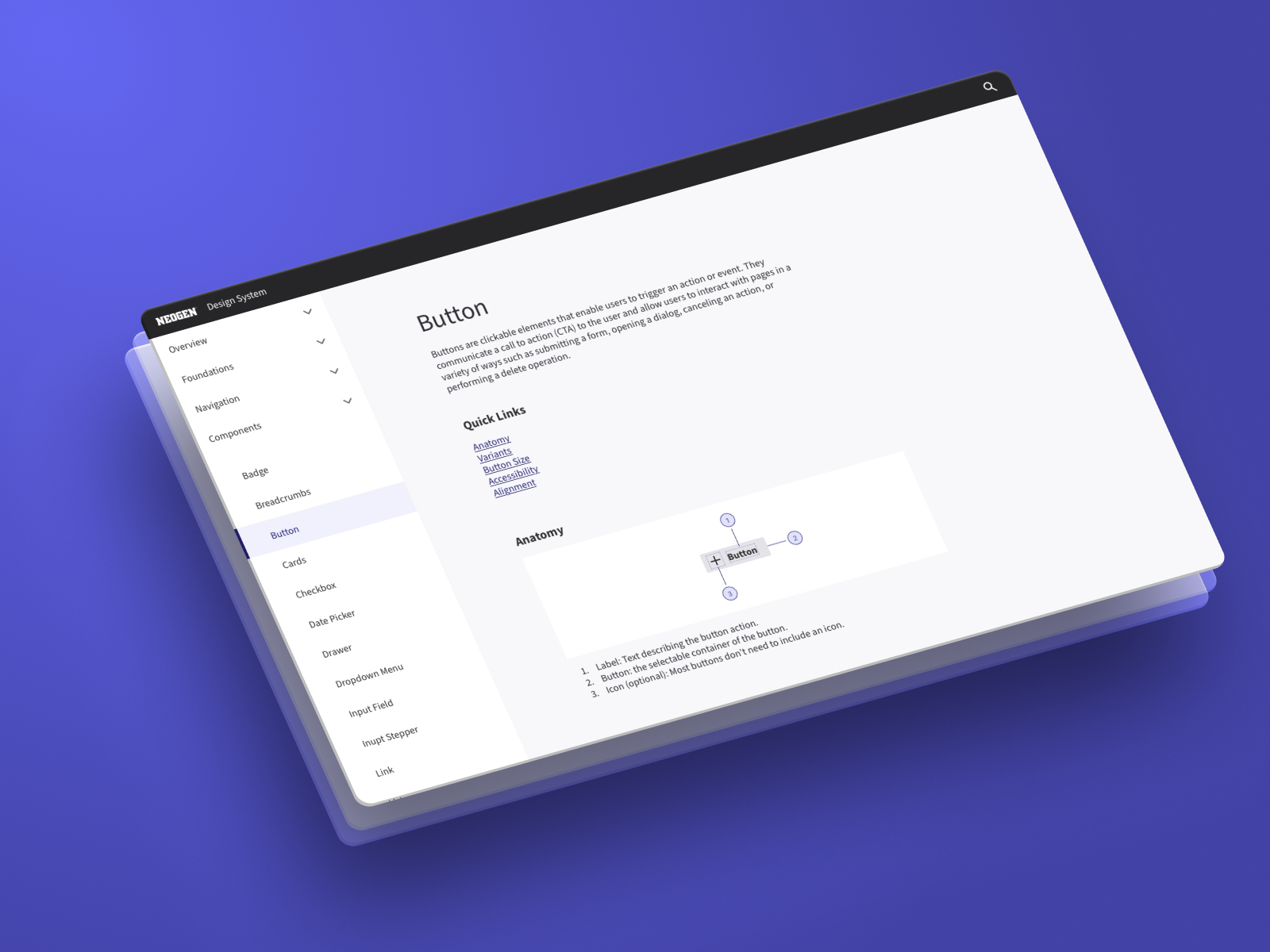
7 button variants, No shared design language or library, 2x rework on every page or feature

1 button, 5 defined variants, design tokens, Figma > Storybook (auto-sync)
Discovery
Competitive Analysis


Opportunities for impact
Brand language
To publish and reinforce Neogen’s new brand identity by applying uniform visual elements across our digital ecosystems; software, integrated GUI.
Design governance
Product teams can refer to a well documented library as the primary source of information. Adhering to the guidelines for each component or pattern. To maintain and evolve the system through a managed process.
Reusable parts
Reusing components across products reduces the amount of code we have to manage improving development efficiency. UX patterns, interaction design, and accessibility should be defined at a global level. Tokens.
Scale the system
This system offers various size and color options for all components to accommodate hardware and software screen sizes. Continuously evolve and improve to work across segments.
Audit discovery ⸺ User Interface (UI)
Brand language discrepancies
Each application had a different applications of the corporate colors and logo, making the brand unrecognizable.
No standard reporting patterns
Reporting interfaces vary significantly across products, resulting in inconsistent user experiences and increased effort to analyze data.
Single-use components
Software teams building the same component per page or having each team build their own. Component elements and states become inconsistent over time.
Audit Discovery ⸺ User Experience (UX)
Inconsistent notification patterns
The applications had unnecessary warnings banners. Cryptic messaging made error handling difficult for users to understand, leading to confusion and frustration.
Platform specific paradiagms
The majority of customers use on-premise software, many of which have individual backends. Legacy platforms have a longer set up time and can come with a higher up front cost.
Static / Fixed-width design
Legacy software was built before responsive design and SaaS platforms became standard. Customers are reluctant to change making it difficult to sell upgrades.
A new foundation
Vision and principles
Building on the 3M Design Kit, we are developing a new framework with guidelines and standards to establish design governance for the new Design System.
Overview
The Component Library 1.0 is a comprehensive set of standards intended to provide design governance at scale using reusable components, patterns, guidelines and code, which allows us to build consistent experiences more efficiently. The use of pre-built assets speeds up the time teams spend creating and building screens.

Consistency
The design system will govern and uphold brand standards by ensuring consistent and repeatable design outcomes, independent of individual preferences.

Efficiency
Utilizing reusable components and pre-defined patterns enhances team efficiency and eliminates the need to re-build components.

Cohesion
It will provide us with a common language, aligning business groups and stakeholders across the company.
Principles
01
Accessibility
Inclusive Design: Ensure that designs are accessible to all users, including those with disabilities, by adhering to accessibility standards (e.g., WCAG).
02
Performance
Optimize Load Times: Design with performance in mind to ensure fast load times and smooth interactions.
03
Essential & Minimalist Design
Prioritize User Needs: Focus on the core needs and tasks of users, highlighting the most frequently used features.
Streamline Content: Reduce unnecessary content to bring essential information to the forefront.
04
Responsive, Scalable, & Modular
Adaptability: Ensure designs are responsive, adapting seamlessly to various screen sizes and orientations.
Future-proof: Create a scalable and modular design foundation that supports growth and performance improvement.
05
User Semantics & Recognition
Speak the User’s Language: Use familiar terms, phrases, and concepts that resonate with users.
Natural Order: Follow real-world conventions and logical sequences that align with the users’ mental models.
06
Consistency & Standards
Uniformity: Maintain consistent use of components and patterns throughout the application.
Adhere to Expectation: Align design and functionality with established user expectations and industry standards.
07
User Control & Freedom
Empowerment: Give users control over their interactions, allowing them to make decisions and navigate freely.
Intuitive Navigation: Design interfaces that facilitate easy and intuitive navigation.
08
Error Prevention & Recovery
Prevent Errors: Design systems that minimize error-prone conditions and provide clear, concise feedback.
Support Recovery: Implement features that allow users to undo actions and recover from mistakes easily.
09
Collaboration & Transparency
Cross-functional Collaboration: Foster collaboration between designers, developers, and stakeholders.
Transparent Processes: Maintain transparency in design decisions and updates to ensure alignment across teams.
Component Library ⸺ Information Architecture (AI)

Strategy Planning


OEM Partnerships


