
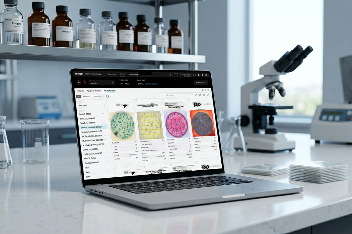
A software experience that supports high-throughput food-safety laboratories in reading, reviewing, and documenting microbial testing results.
How I contributed
Designed a content-aware software system giving technicians real-time visibility into run status, progress, and results — with guided error recovery and structured review states that improved traceability and lab throughput.
Company
Neogen Corporation (formerly 3M)
Product
Petrifilm™ Plate Manager
Role
UX Design Lead
Year
2022-2024
Platform
Desktop PC application
How might we…help technicians understand system readiness, recover from interruptions, and complete traceable results review without constant device supervision?
Discovery
Early concept validation with domain experts

of
Individual sessions
2
Full workdays
of field research
17
Customers
participated
10 min
Per session
moderated walk-through
At IAFP I ran walk-through sessions with participants which included application scientists and technical-support specialists.
The sessions provided the team with actionable insights into technical feasibility and highlighted critical pain points in the initial user experience.
Early validation showed that automation alone did not make the workflow self-service. Technicians needed support at three setup moments: loading plates, connecting to existing LIMS workflows, and creating traceable plate labels.
User Acceptance Testing (UAT)
Session takeaways
Validating all workflows before the product launch. Using key workflows we invited our internal experts from customer success, microbiology & engineering.

5
Key workflows
validated end-to-end
6
Internal SMEs
microbiologist, customer success
60 min
Per session
participated individually
Usability testing – System Usability Scale
What the SUS score means
An average SUS of 62.71 across 7 participants places the experience in the “High Marginal” band; just below the acceptable threshold.
The friction is concentrated, showing: 2 of 7 users scored 50 or below, pointing to challenges in specific flows rather than a broad, systemic problem.
The implementation plan
We’re prioritizing the flows where the lowest-scoring users encountered friction.
With focused fixes at transition and exception points, the experience moves from marginal to acceptable before the release.

Themes ⟶ design response
Cross-device status inconsistency
2 issues
PPRA showed green, R5 blue, software red — three conflicting states. The error couldn’t be dismissed, blocking the user. Boot state isn’t reflected in software either.
Design Solution
Unify status language across PPRA, R5 & software — every device state maps to one shared meaning. Errors are always dismissible.
Error handling that blocks progress
4 issues
Non-dismissible errors; technical codes with no guidance; hardware/software state desync; toasts interrupting mid-task.
Design Solution
Every error includes a recovery path. Replace codes with plain-language next steps. Sync device & software state. Route notifications to transition points.
Broken interaction patterns
4 issues
Inconsistent toast sizing; grid scroll only via scrollbar; default preset ignores user type; wrong default view on R5.
Design Solution
Tighten the component library. Fix scroll to native behavior. Zero-state for new users and recall last preset. Default R5 to grid view.
Theme 1
2 issues:
-
Suction cup failure: PPRA showed green, R5 showed blue, software showed red — three conflicting states with no shared meaning. The error could not be dismissed, blocking the user entirely.


-
Boot state not reflected in software: Boot state not reflected in software: During startup, PPRA and R5 both show blue but software shows a generic connected state in white — not indicating the PPRA is still booting. Users have no visibility into whether the system is ready to use.

Theme 2
4 issues:
-
Non-dismissible error state: A suction cup failure produced an error in software that could not be cleared, leaving users with no path forward.

-
Unfriendly modal messaging: A software failure surfaced a technical error code with no actionable guidance. A secondary dialog interrupted the flow mid-task without clear context.

-
PAF vacuum sensor failure (R5 only): Error dialog asked users to check the device, but hardware and software states were not synchronized — not enough context to act with confidence.

-
Toast banners surfacing at wrong moments: Notifications appeared during active work rather than at natural transition points, competing with task-critical information.

Theme 3
4 issues:
-
Inconsistent error toast sizing: Toasts appeared at different sizes within the same session — signals design system gaps and erodes trust.

-
Grid view scroll broken: Scrolling only worked when the scrollbar itself was directly selected. Users could not scroll the page naturally, blocking them from browsing multi-plate results.

- Default preset logic ignores user type: New users saw a pre-selected preset instead of a zero state. Returning users did not see their last-used preset. Stack names were auto-generated before a preset was chosen, creating data artifacts before the user made any intentional choices.

-
Wrong default view on R5: Software defaulted to single-plate view instead of grid view when connected to R5, mismatching user expectations for multi-plate workflows.

Reflection
User trust declines during transitions
The product guides technicians well along the happy path — but testing exposed that trust breaks at transitions and exceptions: exactly where lab work is most fragile. The design response centers on three principles:
- One shared status language across every device
- Every error includes a recovery path
- The system meets users at transition points — it doesn’t interrupt them

Next steps
Targeted iteration on the two lowest-SUS flows; validate the unified status language with a second round of testing; then ship MVP scope.
Case study evidence
Synthesized from 2 days of field research, 17 customer walk-throughs, and UAT with 6 internal SMEs across 5 key workflows.
