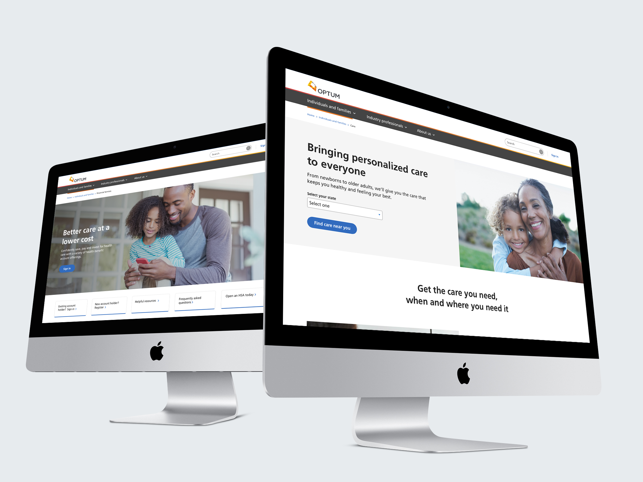
Partnered with Optum to bring structure and cohesion to a fragmented digital ecosystem. The work centered on refining information architecture, redefining navigation patterns, and auditing components across multiple properties.
How I contributed
Reconciled inconsistencies and enhanced the design system—rebuilding critical components where needed—to improve usability and scalability. Delivered seven fully realized pages spanning UX, visual design, and copy, along with a robust design library in Sketch and detailed documentation. This framework enabled Optum’s internal teams to efficiently scale and complete the remaining experience with consistency and confidence.
Company
Wunderman Thompson
Client
Optum
Role
UX Designer
Year
2021-2022
Platform
Website application
Objective
To build a resilient, customer-centric Optum.com by consolidating six fragmented experiences into one seamless destination that addresses core customer needs.
Empathizing with user behavior
Archetypes focus on user behavior and motivation; providing narratives that one, or many, of our customer segments may experience throughout their journey with Optum.


The Seeker
New customers looking to gather information, understand offerings, and evaluate potential partnerships.
Seekers are frequently new to Optum and are evaluating a vendor on whether it might be the right fit for their needs.

The Planner
Customers that are looking for solutions and services that can grow with their needs.
Planners are looking for vendors that can provide both short- and long-term solves that address needs, challenges, and requests for self-and/or constituents.

The Connector
Uses their network and industry experience to connect vendors and customers.
Connectors are the middleman between vendors and customers, facilitating the flow of information, recommendations, and resources.

The Independent
Self-reliant customer in the healthcare landscape that manages most of their healthcare information independently.
Independents are resource hungry, and eager for vendors to simplify their offerings and provide guidance.
Competitive analysis
Preliminary research
To set benchmarks we evaluated 3 direct competitors of the healthcare industry against the same 5 themes. According to the competitive analysis, competitors lack a cohesive experience for their offerings; we can capitalize on this gap by designing intuitive wayfinding.


Analysis table
No one within the healthcare space is setting an overall standard that we want to measure against. According to the competitive analysis, competitors lack a cohesive experience for their offerings; we can capitalize on this gap by designing intuitive wayfinding.
Benchmark summary
- Enable audience segmentation and self-selection to help users quickly identify relevant products and services.
- Provide contextual support and progressive disclosure to guide users through complex healthcare decisions.
- Context-aware navigation with persistent access to support tools.
- Establish a credible, transparent tone that builds trust around complex healthcare topics.

Themes
1
Customer centricity
Experiences are most successful when they are designed around the customer.
2
Brand impression
A clear brand story expressed consistently can help tie offerings together and leave a positive impression.
3
Wayfinding
Effective navigation, and clear guidance to help users feel confident in navigating complex environments.
4
Ease of use & efficiency
The experience should support all users with varying goals and abilities and strive for ease-of-use.
5
Consistent standards
Users should not have to wonder whether different words, situations, or actions mean the same thing.
Archetype flows
Each goal maps directly to a pain point identified in synthesis.


Establishing scalable page templates
Developed modular wireframes to standardize layouts across product, solution, and marketing pages. The goal was to create a scalable, flexible framework aligned with Optum’s evolving information architecture and design system standards.

Component audit
Audited the DPL library and Optum websites to identify opportunities to consolidate, reconcile, and modernize existing components—reducing redundancy and driving greater consistency across Optum.com.


Reducing cognitive load
Key component improvements
Users can quickly see which filters are applied and remove them in a single click.
1
Progressive disclosure
Collapsible sections reduce visual clutter.
2
Active filter visibility
Users immediately know what data is shown or hidden.
3
Clear visual hierarchy
Parent-child filter relationships clearly displayed.
4
Easy selection removal
Close button on chips allows for quick deselection.

Hero banner layout
Collaborating with visual designers, we evaluated how imagery, copy, and layout adapt across variants to meet accessibility and usability standards, while defining clear usage guidance within the design system.


Documentation
We created detailed documentation for each of the 26 components in the design library, making it easy for Optum’s internal team to pick up and scale the rest of the site. Below are two fully documented component examples.
Design language system (DLS)
Simplifying the system
- Design Systems: Architected a comprehensive component library and all core documentation within Sketch.
- Content Strategy: Managed the end-to-end copy workflow, partnering with a copywriter to finalize content for 7 landing pages.
- Strategic Design: Optimized word choice, text density, and CTA placement to balance design constraints with messaging goals.
- Version Control: Utilized Abstract for revision tracking, version history, and collaborative designer-to-developer hand-offs.
